Sunday, August 29, 2010

Domo


This last piece is a design that I created for a Threadless design challenge for Maxtopia. The subject was basically about the blending of Nature and Technology together to create a new world. So i created a design that relates directly to the annunciation of these seamlessly blended yet contrary elements. This represents the physical manifestation of a very planar robots longing for organic elegance. Also, I figured if a robot was going to dream of anything organic it would be the flower most associated with canonical purity, the lily.

Score it here (once it's accepted)

This will probably be my last post for the month of August and overall I am quite pleased with not only my prolificacy but the standard for the quality of work I've set for myself. Score it if you like, follow the blog if you wish, and as always, happily view.

Monday, August 23, 2010

Shiver Me Timbers


This is a label design that I created several months ago for a friend who was considering venturing into the distillery business. The theme was quite nautical and focused heavily on the seafaring adventuring of the buccaneers. This was a good chance for me to experiment more with hand-lettering and paint one of my favorite subjects, skulls. The type and the colors are designed to mimic the flamboyant clothing and eccentricities that buccaneers are usually depicted as having, as well as the raw and slightly sinister nature that made them famous. Overall I am satisfied with the way this project came about and was finished, for now that is. It was interesting to work with someone who I know quite well but hadn't worked professionally with before. I really enjoyed dialoging back and forth and trying to make the label fit my friends needs, it always feels very rewarding to collaborate in that way, especially if it's challenging. More labels to come? perhaps. I will also have pictures soon of the paintings that I have been working on, so stay tuned and as always, happy viewing.

Wednesday, August 11, 2010

This Ain't no Party, This Ain't no Disco Daphne

I've been listening to a lot of Talking Heads, hence the obscurity of today's title. Regardless of the worded obscurity, my efforts are becoming slightly more clear with this latest piece, a direct homage to the story of Apollo and Daphne (or at least Daphne).

The inspiration for this came from the blog Illustration Friday, where I will be submitting it soon (a few more changes might be coming, you never know). Illo. Fri. is a blog where people can create and share artwork inspired by a weekly prompt, and the prompt for this week which was "caged." The story of Apollo and Daphne in a very tiny nutshell is this: Young amorous Apollo is struck by cupid's arrow with irresistible love for Daphne (a nymph who's father was a river spirit named Peneus). Daphne flees from the young sun god's advances and pleads for her father to rescue her in some way, shape, or form (PUN), and he turns her into a Bay Laurel (tree). That's good parenting like only classicism can dish it. At any rate, paternal discrepancies aside, I elected to illustrate Daphne being "caged" in her new form. So, we're off.

I started with a small sketch (that needed a lot of work):

I brought this into the computer, scaled it up to size and then decreased the opacity so that the lines would be more faint so i could print it and do this to it:

Feeling much more satisfied with this foundation, women are hard to make up off the top of your head by the way (way to go ladies), I transferred it to the final paper and went at with the gouache and this is the end result:

I'm satisfied with the way the piece came out and I think definitely adds a lot to my burgeoning portfolio. I'm pleased with the atmospheric energy contained in the background, especially those white, pink, and blue trails of light. In addition to that, I enjoy how pink Daphne is in contrast to the golds and browns of the trunk and how her features are beginning to be exaggerated and combined with those of the tree (this includes her dramatically elongated neck and shoulder). I also just really like rendering tree bark (A LOT). Speaking of which, I've got a few wordless (possibly not) comics lined up on the docket for the next coming months and one of them is going to be very densely wooded, so expect more bark.

Oh, and in terms of expectations, I've also been working on 4 large scale paintings that I am hoping to bolster my "fine arts" portfolio with for gallery submissions this fall but my camera is still swimming in the mess it made in it's bed so no pictures for a while. There will be more soon, although probably not next week because I get to spend a week adventuring and relaxing with my family and my wonderfully talented and doubly beautiful (in oh so many ways) girlfriend Melissa Schmid.

So there might be a lapse in the frequency of posting but have no fear, there is more on the horizon, even if it ain't no mud club, or CBGB. Happy viewing as always!

Wednesday, August 4, 2010

A Fool and His Sandwich are Soon Parted


This piece was really just a chance for me to get out of the labored, mechanical process of the both Mr. 1/2 Full and the Magic Mountain, which involved a lot of careful measuring and patience. Not that this didn't, ah well, the best laid plans.

At any rate, this guy took a while to complete but I like the way he came out, especially those slippers. It was a good chance to get into the gouache and just build on my familiarity with it too. After i brought him into the computer I altered the background colors slightly, making the green in the background a touch more blue and the gray of his step a bit more red. I also extended the height of the canvas a bit, he felt a bit cramped.

I'm definitely going to be using gouache more frequently, I like how it moves. Mostly. So here it is, the sad tale of a man with no head and a slippery sandwich, enjoy!

Buck Up!

So, as I mentioned previously I've been working on a poster for a campaign launched by the folks over at positive posters giving a prompt of "a glass half full." Well, here's my response:

This represents my first real exploration of the poster format, and I've got to say, I like it. I'm pleased with how this one came out, especially considering the lengths I went to complete it. I painted all of Mr 1/2 Full and the words below him in gouache and then outlined those segments in pencil on vellum. Those parts were scanned in pieces because my scanner isn't a large enough format to handle the size that I had created them on, so it took a little fiddling on the computer to make it work. Did I say a little fiddling? I meant more than a little, like a lot. I don't normally like how images look when I piece them together but I think in this particular case it's not very noticeable.

Originally I wasn't going to have the words above Mr. 1/2 full but I think they add a little bit more self-awareness and direct relation to the prompt itself. those elements were also drawn with pencil on vellum. I decided that the plus shape of Mr. 1/2 full was getting lost amidst all of his angles and edges so I traced the most frontal +, scanned that in and digitally colored it white, I think that works pretty well.

Like I said, I'm pretty satisfied, and my entry has been officially submitted and is awaiting review by the "moderation queue." It should be up in the next couple days (I'll post a direct link to the page when I get confirmation), happy viewing!

Sunday, August 1, 2010

Necessity is the Mother of Designing Book Covers

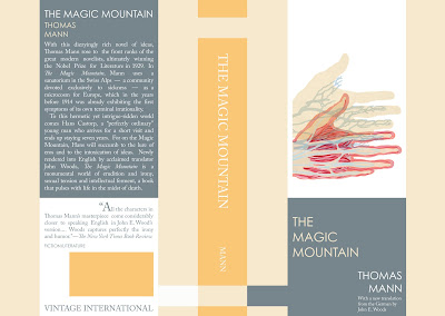
I'll admit that it's not entirely catchy, but in this particular instance it's at least highly relevant. So a week or so ago I was careless with my water bottle and managed to make quite a tidy mess of things, nearly spoiling several very important accessories and causing water damage to the book I am currently reading, Thomas Mann's The Magic Mountain. Well, the cover was ruined and ended up falling apart. I had been planning to try my hand at book design anyway, and I thought why not now? So, having lost one rather poorly designed cover, I gained a slightly less poorly designed one. The illustration and the design are both of my creation.

The illustration references a turning point in the book, when the main character turns from a visitor to a patient of the sanatorium where the novel is set. It also draws on the medical journals and medical investigation that pervade the spirit of human dissection and study (both mental and emotional) that makes up a large portion of the narrative's intrigue. Hans slowly becomes separate from the self he once knew in the "flatlands" as he becomes more and more involved in the life nestled in the shadow of the magic mountain. I like the color scheme. The view here shows both the front (on the right) and back (on the left) cover divided by the pumpkin colored spine. Hope that you enjoy, happy viewing!

A Call to Arms

So, as I've very recently explained, one of the primary goals of this blog is to increase the breadth of my Illustration and Design portfolio. I am really just beginning my foray into both fields, having graduated from MICA with a painting BFA in '09 and an MAT degree in Art Education this past spring. So, in the spirit of self-actualization and the enterprising nature it clearly requires to be successful in either field I've been giving myself assignments and taking what I can from the thriving communities that already seem to be very much in play. There have been several blogs and general sources of inspiration, creativity, and positivity that have been particularly helpful at the start of these efforts. Not least of which being the Escape From Illustration Island blog and Podcast by Thomas James and the Zero 2 Illo Blog of Jonathan Woodward, where I found the call for entry that inspired the creation of this poster design. the design isn't quite finished yet, but it is in response a prompt set forth by the folks over at Positive Posters based off of the idea "a glass half-full." I was hoping to draw on the unending charm and chirpiness of early anthropomorphic advertising cartoons and a sense of calm and pleasant support with the color and font formats. As I said, he's not quite done, so you folks might need to wait a couple days, stay tuned!

Bang! false start.

After other unsuccessful and ultimately abortive blogging efforts, the race is on! Against...myself. Well, regardless of how many attempts have been made previously, I am intent on making this one stick. The purpose of this blog is essentially this: produce artwork and display it publicly in hopes of not only finding a niche for myself in the creative world, but also for creating a source from which I can relate more directly to the ever-expanding creative field and one to which it, in turn, can relate back. I'm currently spending the Summer months working diligently to on expand my creative portfolio by creating a series of paintings (pictures of which will begin to surface in coming posts) and generally creating a solid foundation for an Illustration/design portfolio to begin distributing this upcoming Fall to potential employers while looking for the possibility of freelance work in either of those fields. And so, without further delay, my name is John Gilman, and welcome to Notes from the Fence.

This is just a very introductory picture I painted in my sketchbook, it's a woman breathing smoke apparently.