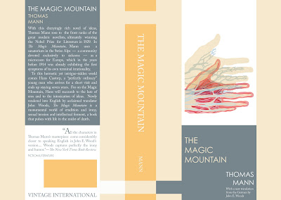
The illustration references a turning point in the book, when the main character turns from a visitor to a patient of the sanatorium where the novel is set. It also draws on the medical journals and medical investigation that pervade the spirit of human dissection and study (both mental and emotional) that makes up a large portion of the narrative's intrigue. Hans slowly becomes separate from the self he once knew in the "flatlands" as he becomes more and more involved in the life nestled in the shadow of the magic mountain. I like the color scheme. The view here shows both the front (on the right) and back (on the left) cover divided by the pumpkin colored spine. Hope that you enjoy, happy viewing!
.jpg)

well done. especially because the "real" covers i've seen are awful. you should post an image for comparison!
ReplyDelete