Friday, September 24, 2010
Old Fashioned Rabbit Ears
Hey there folks, I've got a new design up for voting on Threadless. It's called Old Fashioned Rabbit Ears, so drop by and check it out, vote, and maybe even say you'd "buy it as a tee." You can vote to the right of the design and the more votes the design gets, the more likely it is to be accepted. If you say that you would "buy it as a tee" or "as a print," then the chances of it getting selected are even higher. So, stop by Threadless by clicking on the link below and let your opinion and vote be heard!
Thanks a lot for the support and votes, I really appreciate them both!
Labels:
Design,
Digital,
Graphite,
Illustration,
Tees,
Threadless
Thursday, September 16, 2010
One Stone, Two Birds
Alright, so here's the deal. I'm publishing this as a post for Illustration Friday's most recent prompt: "proverb." Now, what the illustration actually depicts is someone "seeing the world through rose colored glasses," which is really more of an idiom or expression than a proverb. HOWEVER (and here's where it gets tricky), I had this drawing that I had done for another post that I never got around to finishing so I thought that this would be a good chance to finish the illustration and complete a response for this week's IF, and in that way I would be able to "get two birds with one stone," which is traditionally recognized to be more of a proverb. KABLAMMO. John Gilman, Professional fine artist, illustrator, and designer, and Amateur Rationalizer seeking endorsement to go pro.
+Someone who wears rose colored glasses sees the world around them only as they want to, rather than seeing the reality of the situation.
Following my work on the last post with physical media, I really wanted to achieve a more cohesive appearance for this piece through employing a bit more texture and atmosphere, so with that in mind let's boogie.
I started with a drawing that I finished in pen and ink on moleskin paper (I wanted something with less tooth). When I drew this one I was going for a more graphic feel, especially with the pen. Here's the drawing once I brought it into the computer:
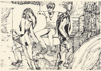
I then isolated the linework using the method that I've recently adopted (which works like gangbusters and I am very excited for), and proceeded to begin the process of flats. I wanted the area contained in the rose colored glasses cone of vision to be much more planar and tidy and the grungy world of reality.
You can see that at this point I didn't put in the planks of the rose bench or the vertical pattern on the curtain behind the bench that the left-most tree becomes in the rosy realm.
Next I changed the colors to match with my original intentions, by using mostly passive, appealing, and warmly seductive (oh my) colors in the rose colored world and more jarring, subtly sallow colors in the real world. I began adding more tones and variations in the colors at this point, and here's what it looked like with the right colors mostly placed in:
Now then, on to that cohesive texture I was talking about earlier. I wanted to add a gray/sandy textural haze to the real world and a pinkish glow to the rose world. I used graphite and powdered charcoal on vellum and scanned them into the computer. Fortunately the line isolation technique is so effective it even picks up such subtle variations as this (for the real world):
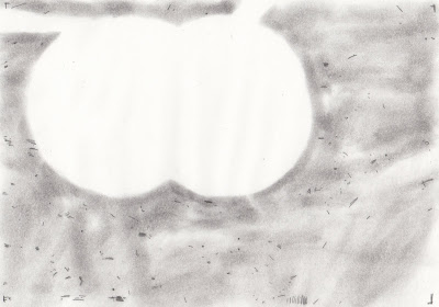
and this (for the rosy realm):
I colored those accordingly and placed them beneath the linework layer and this is what we have without the linework visible:
Sam Bosma did a wonderful job of explaining this process on his blog and it was an invaluable resource while I was working. He's also got some pretty stupendous work, y'all should check him out. This is the final piece again, after having lightened the highlights for the whole thing a bit and removing some of the glasses-wearing man's wrinkles to make him look less like an old lady:
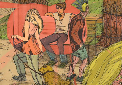
I'm satisfied with the final result and I'm excited for all the possibility that this texture-layering process holds for my other works. I've also got a few more t-shirt designs on the docket so look for them in the near future. I hope you've enjoyed my lengthy rant and that you've had a pleasant time viewing, and that you'll stop back again in the future.
Labels:
Digital,
Illustration,
Illustration Friday,
Pen + Ink,
Process
Well Ali Baba had them forty thieves, Scheherezad-ie had a thousand tales
What can I say, I'm a sucker for slightly xenophobic depictions of foreign cultures and systems of belief, call me a traditionalist. In actuality this was not created in response to a recent viewing of the 1992 Disney flick, but rather due to a personal love of history, literature, and mythology; all of which the Arabian Nights holds in spades. And with those passions in mind I set myself upon redesigning the jacket for this lovely gem. I wanted to create a subtle yet striking image of Shahrazad veiled and slightly pensive (with a touch of fearfulness thrown in for good measure).
The story of the Arabian Nights is essentially this: Shahrazad (Female Protagonist) is wed to the king of Persia (Shahryar). Gum Drops and Rainbows right? Not really. See, Shahryar had a nasty habit of killing his wives after only one night of marriage. Shahrazad resolved to keep herself alive by telling stories that she began in the evening, told through the night, and always left the ending unresolved. In this way, so long as her stories held the king's interest through the night her life would be spared. And there's a happy ending too. What a strange story.
At any rate, I knew that I wanted to depict Shahrazad (spellings vary by the way but I'm staying faithful to the spelling found in this particular text) and include subtle allusions to arabesque design and architecture. After working digitally for the past few pieces I really wanted to explore the subtleties of physical media again, paint in particular.
And we're off! As usual, I started with a drawing that I scanned into the computer, lowered the opacity on, and printed out to resolve issues and create a finalized pencil drawing, which we find here:
I extended the hair for the wrap-around cover but didn't bother to place it in the final drawing because I wanted it to remain largely abstract so that it would begin to unravel as her stories do. This was painted in Watercolor first, then I laid a white acrylic wash over-top of the entire painting and blended the two paint layers together to create a hazy sense of sfumato. I wanted to make her seem faded and worn, seeing as she is perpetually in danger of being killed and all. I went back in with watercolor and added some more subtle detail in the face and hair and repainted the majority of the veil with gouache. This is the product of those efforts:
This was painted on a large format piece of paper so I had to scan it in as two parts and piece them together digitally, which I think is hardly noticeable in the final work (which is good, huzzah!). With subtlety in mind (notice a trend with this one?) I chose the colors, blocked out the areas of text, and reduced the opacity to allow for elements of the painting to show through. I also scanned in the barcode and publishing house logo to allow for more authenticity in the design. After playing around with the font quite a bit this is what resulted, the final cover once more:
I am pleased with the final product and think that I achieved most of the goals that I had set for myself for this piece, particularly with regards to the SUBTLETY. ahem, excuse me. This was fun to do and I really enjoyed working with the watercolor, acrylic, and gouache combo so expect more of that on the horizon. I plan on printing this out and putting it on the book itself so I can photograph the physical product, not just the digital plan. So that's just about it, with more struggle, triumph, strife, and joy mixed in of course. Hope you enjoy it, view happily, and in parting I will leave you with more words of wisdom from the masterful Alan Menken:
Arabian nights
Like Arabian days
More often than not
Are hotter than hot
In a lot of good ways.
Labels:
Book Design,
Design,
Illustration,
Painting,
Typography
Friday, September 10, 2010
Sweet Summer Rain
This was intended to be submitted last night for this past week's Illustration Friday prompt but it didn't quite make it in under the wire and I wanted to be satisfied with it rather than display something I was unhappy with. And so here it is on the blog! The given prompt was "dessert," and I've seen my fair share of ice cream being eaten and worn this summer so I thought it was only fitting. I recently discovered an even better way to transfer line into Photoshop so that it maintains its integrity and subtlety, so this week I wanted to take full advantage of that. And so, as I usually do, I began with a sketch:
And from that sketch came a more resolved drawing and finally a finished drawing done with graphite on vellum, scanned in, the line isolated, and a quick background color laid in to give a bit more context before going into flats:
This next step might be the most time-consuming, tedious, and a bit thankless actually. It's hard to keep your head above water when the water looks like an undulating paint-by-numbers ocean. However, in the long run laying in flats is totally worthwhile and really advantageous for color isolation and really quick color manipulation from a higher layer. Basically the idea behind flats is this: so long as the adjacent areas aren't the same color (or similar for that matter) you can block out all the major areas and then quickly color them by selecting them with the wand tool and adding the appropriate colors later. Here are my flats:
Like I said above, this makes it easy to then determine the primary colors that you want to use, and here they are (immediately after having finished flats):
After this point is when I can start to resolve and soften the edges a bit more and put in some cleaner and more satisfying points of transition (particularly in her face and grass). Also I drew in the sweet summer rain itself, the falling drips of ice cream. I wanted to do them digitally because I thought it would be pleasing to draw attention to their presence stylistically to provide a point of interest through contrast, and I'm glad I did. Here's the final paint layer before laying the linework back in:
And here's the final image again, linework and all:
Overall I am really pleased with how this piece came out, and I am definitely excited for what the future holds.
Also I wanted to have a link to a clip of Daniel von Bargen saying "Sweet summer rain" from Oh Brother, Where Art Thou? but I couldn't find it on YouTube, so use your imagination.
So there you have it, my most recent piece from start to finish (mostly), although admittedly very abridged. I hope that this sheds a bit more light on some parts of the process that I hadn't addressed previously. Look for a few more pieces being added next week sometime, and hopefully an Illustration Friday post that will present itself in a timely fashion (I'm thinking something quicker, good sweet bippy!) Thanks for stopping by, and happy viewing!
Labels:
Graphite,
Ice Cream,
Illustration,
Illustration Friday,
Linework,
Process,
Summertime
Thursday, September 2, 2010
Immovable
Hello again all, this here represents my first post in my second month of posting, wahoo! In all seriousness I'm glad that I've been able to keep up the pace I started in Maine upon returning to the beloved land of my birth, Pennsylvania. This piece was made in response to another Illustration Friday prompt, this time the topic given was "Immovable." I decided to pair the immovable element, which is purposefully very static, with a fiercely agitated scene involving two lovers in a highly dramatic spat. Seen above is the result of my endeavors, a clear cut case of an unstoppable force meeting an immovable object.
This is my first time really working with digital coloring, and I think that there is a lot of potential for future success. One of the greatest benefits is that it is significantly easier to manipulate and alter colors and compositional elements on the computer, which makes the whole process less stressful. Parts of the physical drawing irk me a bit, like the way the man is rendered, especially when compared to his female counterpart. I wanted to create a more dynamic composition with this piece and I think I succeeded, especially compared to some of the previous work that I put up.
Here's how the process went down:
First, I started with the final sketch:
From here I put it on the light box, got out my final paper and proceeded to set about inking it. The product of those efforts was this:
I then scanned this into the computer and attempted to isolate the line (something that has given me heaps of trouble in the past) and begin digitally coloring it. This is what it looked like to start, after I had done the flats, a process which I will be elaborating on in one of my next posts probably (I've got like 3 projects going right now).
Notice that white haze that covers the whole thing? That's the problem with the line isolation that I was talking about, its the tooth of the paper that got transferred when I attempted to copy the line. Basically what was happening was this: In trying to isolate the line I select all of the background white on a grayscale channel first, then I would normally just opt to "select inverse" and that would then select and copy the linework, then being able to paste it into a new layer.
However, when that final stage would roll around I would be dissatisfied because that white haze would remain, which honestly was thoroughly frustrating. I experimented and realized that when I selected the white of the background initially I needed to delete that selection and only THEN could i select the linework.
This got rid of that gross fuzz and left us with our final image:
Like I said, I am quite pleased with it as a whole and I am very excited for what the future holds for me and digital coloring. There will be more coming next week I expect, LOTS MORE, so stay tuned and as always, thank you and happy viewing.
Subscribe to:
Posts (Atom)