Showing posts with label Digital. Show all posts

Thursday, February 3, 2011

[But Don't Give Yourself Away]


Hey there everyone, here is my latest piece for IF based very loosely on the subject of "surrender."  What does the image above have to do with surrender you ask?  Truthfully, not much.  For those of you not on the East Coast or in the Midwest I guess winter surrendering to spring isn't as pressing, but for those of us in either region, it is.  I suppose that's just about as much relevance there is, it was pretty much just an excuse to draw over-sized Sasquatch/Wendigo tracks with a few creative embellishments from yours truly.  These are really just an opportunity for me to keep practicing and stocking my artistic arsenal.  Considering the turnaround time for these prompts I've been pretty satisfied with the products thus far, with obvious elements that I would change/alter were I allotted more time/knowhow/experience etc.

This one in particular took a while to color (which still isn't completely finished but it's close enough for government work).  The drawing came along pretty quickly and the layers of texture came together rapidly at the end as well (note the breath from the hunters, the pollen from the tropical plants, and the shadows under the trees).  SO for the next one my goals are pretty much the same, work on color and the initial drawing a bit more, and add more tertiary layers of texture to feather some of the "cleanliness" of digital work.

Unless this next prompt is really mind-blowing I might take a week-long break from the IF crawl to work on personal projects (BECAUSE I HAVE SO MANY ON THE DOCKET), we'll just have to wait and see.

Thanks for stopping in and I hoped you liked what you saw!  Enjoy the snow if you have it and the sun if you don't!

P.S.  Those with snow are also encouraged to enjoy the sun.

Thursday, January 27, 2011

The Old Dusty Trail, and Hitting It.


Hey there Everyone, I haven't been posting as much as I'd like in this past week or so but I think I've been making quite a bit of progress in that time.  I've found a bit more direction with regards to the sort of style I'd like to pursue in my more illustrative work, huzzah!  And with that jubilant declaration I present to you my most recent Illustration Friday submission, meet Dusty (the only man who could ever reach her, was the son of a preacher man, yes he was).

I'm really happy with how this turned out, and moreover I am very excited about what it holds for my future work.  While working on Dusty here I reaffirmed why the idea of flats is such a good one, particularly when you use them correctly!  I'm not gonna get into what I was doing incorrectly just yet, but I might in a follow-up process post.  I also found more insight into how it is exactly I want to use secondary and tertiary layers of texture to bring a more conclusive/cohesive appearance to my finals.  ALSO I think that I've finally spent enough time familiarizing myself with Photoshop that it's becoming much more of a genuine aide rather than a frustrating intern who never shows up on time and you suspect is stealing all of the red paperclips (which are, of course, your favorites).

Honestly the biggest irritation I have with this piece is the drawing itself.  It was a bit rushed and I could have definitely considered it more fully.  However, because these are due within a week of the subject being announced I needed to cut corners a bit somewhere, sorry draftsmanship.  SO for the next projects I will be taking a long hard look at the actual drawing itself, the color relationships, and a bit more preliminary planning, whew!  

Also, this piece is dedicated to my good friend Karl LaBarbara, who recently moved from the Philadelphia area to San Antonio, Texas (turns out dedications make people sound deceased, I promise he's not).  Good luck hitting the Ol' Dusty buddy, here's hoping it doesn't hit back.

Tune in sometime later in the week for some sketches or something!  Who knows?!  Thanks for stopping in, and happy viewing!

Saturday, October 9, 2010

Carpe Diem


Hard to believe, perhaps, but I've got another Threadless submission up for voting.  This is just a general design, meaning that it wasn't done for any particular design challenge, just for the thrill of it!  And the hope that it gets printed and I get some extra spending monies and an even stronger foundation on Threadless.  As I said in my last post most of my ideas start with a pun and then eventually transform into something else, and that is very much the case with Carpe Diem.

And so, without further ado, let your votes and comments ring clear through the sky like the dawning of a bright new day!  Or, like the meticulous digitizing of 1 and 0's in a coded sequence to give your opinions manifest!  Whichever encourages you to head on over and check out the design, give it a vote, and maybe even leave a comment or elect to "buy it as a tee," or "as a print."  Thanks again everyone!

Carpe Diem - Threadless, Best T-shirts Ever

I hope the true start to everyone's Fall season is going swimmingly, stop by again soon for more fun stuff!

Tuesday, October 5, 2010

H.B. Moustache, Esq.


Hello there everyone, sorry for the slight drought in posts lately, I've been busy trying to put the finishing touches on a number of designs/illustrations at the same time so the completion rate has been slightly slowed.  I promise there are many to come in the (nearly) immediate future.  The first and foremost is this design I just submitted to Threadless for voting.  It was inspired by the current (at the time) design challenge for Movember, or, the Moustache Month of November.  As with many of my designs, the basis is found in a pun, but through the imagery and resolution of the drawing, it becomes something more.  In this case, the pun is the pencil moustache that a young man sports in defiance/admiration for his elders and forebears.  I was inspired by Victorian framework and fashion, particularly in the drawing style and the color choices.  And I had a lot of fun drawing all the facial hair.

Thanks to all of you who helped vote for my last design, I really appreciate all the support and encouragement.  It would be great to have that same support for this design.  SO, if you feel so inclined then by all means stop by and let your voice be heard!  Remember: if you want to leave a comment or "buy it as a tee" (check that box before voting on the number system) to increase the chances that the design will be selected for printing then I totally support and encourage you!

Thanks again for checking in and don't be shy about voting!


H.B. Moustache, Esq. - Threadless T-shirts, Nude No More


Happy viewing!

Friday, September 24, 2010

Old Fashioned Rabbit Ears


Hey there folks, I've got a new design up for voting on Threadless.  It's called Old Fashioned Rabbit Ears, so drop by and check it out, vote, and maybe even say you'd "buy it as a tee."  You can vote to the right of the design and the more votes the design gets, the more likely it is to be accepted.  If you say that you would "buy it as a tee" or "as a print," then the chances of it getting selected are even higher.  So, stop by Threadless by clicking on the link below and let your opinion and vote be heard!

Thanks a lot for the support and votes, I really appreciate them both!

Ol' Fashioned Rabbit Ears - Threadless T-shirts, Nude No More

Thursday, September 16, 2010

One Stone, Two Birds

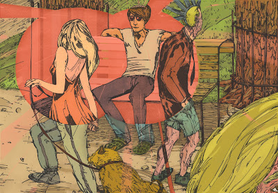
Alright, so here's the deal. I'm publishing this as a post for Illustration Friday's most recent prompt: "proverb." Now, what the illustration actually depicts is someone "seeing the world through rose colored glasses," which is really more of an idiom or expression than a proverb. HOWEVER (and here's where it gets tricky), I had this drawing that I had done for another post that I never got around to finishing so I thought that this would be a good chance to finish the illustration and complete a response for this week's IF, and in that way I would be able to "get two birds with one stone," which is traditionally recognized to be more of a proverb. KABLAMMO. John Gilman, Professional fine artist, illustrator, and designer, and Amateur Rationalizer seeking endorsement to go pro.

+Someone who wears rose colored glasses sees the world around them only as they want to, rather than seeing the reality of the situation.

Following my work on the last post with physical media, I really wanted to achieve a more cohesive appearance for this piece through employing a bit more texture and atmosphere, so with that in mind let's boogie.

I started with a drawing that I finished in pen and ink on moleskin paper (I wanted something with less tooth). When I drew this one I was going for a more graphic feel, especially with the pen. Here's the drawing once I brought it into the computer:
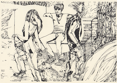
I then isolated the linework using the method that I've recently adopted (which works like gangbusters and I am very excited for), and proceeded to begin the process of flats. I wanted the area contained in the rose colored glasses cone of vision to be much more planar and tidy and the grungy world of reality.

You can see that at this point I didn't put in the planks of the rose bench or the vertical pattern on the curtain behind the bench that the left-most tree becomes in the rosy realm.

Next I changed the colors to match with my original intentions, by using mostly passive, appealing, and warmly seductive (oh my) colors in the rose colored world and more jarring, subtly sallow colors in the real world. I began adding more tones and variations in the colors at this point, and here's what it looked like with the right colors mostly placed in:

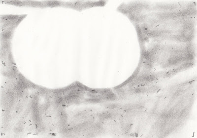
Now then, on to that cohesive texture I was talking about earlier. I wanted to add a gray/sandy textural haze to the real world and a pinkish glow to the rose world. I used graphite and powdered charcoal on vellum and scanned them into the computer. Fortunately the line isolation technique is so effective it even picks up such subtle variations as this (for the real world):
and this (for the rosy realm):
I colored those accordingly and placed them beneath the linework layer and this is what we have without the linework visible:

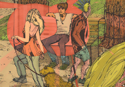
Sam Bosma did a wonderful job of explaining this process on his blog and it was an invaluable resource while I was working. He's also got some pretty stupendous work, y'all should check him out. This is the final piece again, after having lightened the highlights for the whole thing a bit and removing some of the glasses-wearing man's wrinkles to make him look less like an old lady:
I'm satisfied with the final result and I'm excited for all the possibility that this texture-layering process holds for my other works. I've also got a few more t-shirt designs on the docket so look for them in the near future. I hope you've enjoyed my lengthy rant and that you've had a pleasant time viewing, and that you'll stop back again in the future.